
Paper & Paint: My current favourite Art materials
I've used several different brands of cold and hot press paper over the years (the terms cold and hot press refer to the tooth of the paper). Hot press is better for a high level of detail although it’s less absorbent than cold press, so it really depends on what you want to use it for. Recently I've taken to using bristol board with pencil crayon. It's the smoothest surface and great for scanning work (especially book spreads) where the texture of the paper needs to be kept to a minimum. I’ve used both Starthmore and Windsor and Newton pads and both work equally well, although Strathmore has more of a cream tone than the crisp white of W&N. For toned paper I like Strathmore mixed media pad.

Today I thought I’d take you through some of the materials I’ve been using recently.
In no particular order…
Paper
I've used several different brands of cold and hot press paper over the years (the terms cold and hot press refer to the tooth of the paper). Hot press is better for a high level of detail although it’s less absorbent than cold press, so it really depends on what you want to use it for. Recently I've taken to using bristol board with pencil crayon. It's the smoothest surface and great for scanning work (especially book spreads) where the texture of the paper needs to be kept to a minimum. I’ve used both Starthmore and Windsor and Newton pads and both work equally well, although Strathmore has more of a cream tone than the crisp white of W&N. For toned paper I like Strathmore mixed media pad.
Paint & Palettes
I haven't spent a huge amount on paint. My watercolour set is an affordable one from Windsor and Newton. I know the pigment isn't the highest quality but I find it a decent price for the amount I use. I also keep W&N inks and they do the job just fine. For gouache I mix all of my colours from three primary tubes plus black and white. I’d recommend doing this if you’re just starting out, or if you’re wanting to test new materials before splashing out on the more expensive sets. I use Holbein Acryla gouache but I’ve heard positive reviews for both W&N and Caran d’Ache brands, so I’d say do some research and really figure out what type of paint you’re after before you buy. This video helped a lot when I was researching Holbein. The acryla goucahe definitely works more like standard acrylic, but stays liquid enough if you use it on a stay-wet palette. To make mine I lay several sheets of wet kitchen towels in a plastic container, followed by a sheet of tracing paper. This technique allows the paint to stay wet enough to use for several weeks. This video explains the basics of this type of palette.
Brushes
I love Pro ArteProlene Plus for detail as they have a decent point to them. I use Woodpecker for washes as the flat bristles are inexpensive and robust enough to stand the test of time. I also have a dozen of Daler Rowney brushes in various sizes. They’re nothing special but they do the job just fine.
Pencil Crayons
I love building my pencil crayon collection up, so I have quite the mix of brands. I love love Faber-Castell Polychromos and I use these for the bulk of my work. They aren’t too waxy and I’m able to get fine details with them, although I will say that it takes a lot of sharpening to get a thin point. For detail I use Stabilo originals which are a lot more affordable but less pigmented and the lead is not as soft. I also use Caran d'Ache Supracolor II Soft which as the name suggests, have a lovely soft lead, and recently I added some of their Museum Aquarelle pencils to my collection. Both are great for blending with water as well as being highly pigmented on their own. For graphite I stick to Stedtler.
Sketchbooks
I've used a variety of sketchbook brands over the years but I find certain papers haven’t stood the test of time as my style has evolved. I have dozens of Seawhite of Brighton sketchbooks and have used them for many years, but recently I’ve found the paper allows too much bleed for my liking. The paper is a nice cream colour, and I think they’re better suited to sketching than using anything too liquidy. I've also used Pink Pig in the past; their books are spiral bound and pretty easy to get hold of. Moleskine on the other hand is lovely for travel sketchbooks but I sometimes think the price makes me act too precious. (If anyone has any brand recommendations specifically for using pencil crayon let me know!)
Remember that making art doesn’t have to be expensive, there’s a lot of student-friendly brands out there that work well if you’re just starting out. Don’t be afraid to invest in a few tools to help you along the way but remember, art isn’t just about the quality of your materials. It’s about creating the work you want to make and over time, you’ll grow a sense of which materials you like and which ones you don’t.
Happy making!
Meet the Maker
For the month of March I decided to join Meet the Maker over on Instagram. The challenge, organised by Joanne Hawker, happens every year throughout March, and allows creatives from all over the world to connect and share their practice, promote their business, and give insights into their creative journey.
I’ll admit I didn’t complete all 31 days. I decided to pick out the ones that seemed to fit my own practice the best and stuck to those. Today I thought I’d share…
For the month of March I decided to join Meet the Maker over on Instagram. The challenge, organised by Joanne Hawker, happens every year throughout March, and allows creatives from all over the world to connect and share their practice, promote their business, and give insights into their creative journey.
I’ll admit I didn’t complete all 31 days. I decided to pick out the ones that seemed to fit my own practice the best and stuck to those. Today I thought I’d share some of them with you!
First things first, IG is a funny thing when it comes to sharing insights into a creative practice. As I’d already planned what I was going to post throughout the month, I could easily make it seem as though I was staying busy and churning out a load of work, but in truth, my personal work didn’t really get off the ground this month. There were a lot of delays and obstacles I had to work through, most of them probably self-inflicted, and I started to feel disconnected from my creative flow. There were days where I wasn’t drawing anything, because I was focusing all my energy on more urgent, but less fulfilling tasks.
Here is a snippet from Day 15 which sums up how I was feeling:

Day 15 // Priorities
It’s hard to say what my priorities are atm because honestly, my main goal is just to be happy. I know IG can make it seem like we’re always working and always positive but are any of us really like that? I enjoy working on my illustrations but I also procrastinate a lot and spend days unravelling the MANY negative beliefs I tell myself.
This illustration was a favourite of mine but goodness me it was a struggle to get it out. And it’s not even complicated. I was just so uninspired by the limited colour palette, and I think I’d let the whole project drag on a little too long that I started to loose sight of why I started it in the first place. I just wanted to get it done and move on.
I also had several portrait commissions this month which was amazing, but it meant that my personal projects had to take the back seat for a while. The turn around was so quick for these that I unintentionally burnt myself out and had no energy left to put into my own practice.


By the end of March I started to see where I was going wrong. On one hand I managed to stay consistent with Meet the Maker, but behind the scenes I was feeling uninspired and unfulfilled with my work because I hadn’t left any space for myself. I made an effort to pick up my daily sketchbook (something that I’ve sadly neglected since January) and planned to fill it with really bad drawings - the wonkier the better. I started knitting again, and took myself on walks to try and reconnect to that inner creative voice. It’s still a working progress, but slowly I’m beginning to feel inspired by what I’m making again. I’ll be continuing to share my illustrations on IG this month, but I’ll also be holding some of my energy back for work that I purposefully don’t share. And with that comes a new feeling of relief.
If you’ve followed me on Instagram, I hope you enjoyed my little Meet the Maker series, and I hope this post shines a light on the fact that not everything you see on IG tells the whole story.
Shop Update!
New pet portraits have arrived on my Etsy store this month and I’m super excited to share them with you! They’re postcard sized and completely personalised; this one was for a lovely puss named Crumpet and her owner Emily!

I love making these little prints for you, and I’m excited to add more fury friends to the collection! For more info please check the item description on Etsy!
This and that…
*I’m rewatching this adaptation of Howards End at the moment. It’s such a cosy watch and the book is a firm favourite of mine, especially now it’s Spring!
*I listened to Deep Work by Cal Newport this month and he brings up so many interesting points about technology and distractions that made me revaluate how I balance deep and shallow work.
*Any day with yoga in it is an immediately better day. Recently I enjoyed this one.
*Just for fun, this game has been great for passing the time with friends on zoom.
Okay okay that’s all for now! See you next month.
Catherine
Snow Days and Sprinkles
Hello hello friends. How are you?
February seemed to whiz by as fast as ever and I've tried to take things a little slower this month. I baked a lot, sketched and watched the snow, played animal crossing, and last week celebrated my 23rd birthday!
Hello hello friends. How are you?
February seemed to whiz by as fast as ever and I've tried to take things a little slower this month. I baked a lot, sketched and watched the snow, played animal crossing, and last week celebrated my 23rd birthday!

It was a lovely day that began with warm crumpets and strawberries. I went for a much-needed walk with my family in the countryside, and spent the afternoon watching the Sound of Music and drinking hot chocolate. Honestly despite all of the restrictions, it was a wonderful day.
Aside from birthday festivities, I’ve been working on several smaller illustrations after I finished reading Ballet Shoes last month. I wanted to challenge myself with a limited colour palette, and working with single illustrations rather than large picture book spreads has been a new experience! But I love the direction my work is heading in at the moment, and it’s nice to try something a little different!
ALSO! This month I’m offering a 10% discount on all personalised portraits until 19th March, just in time for Mother's day! For more details check the item description on my Etsy shop!

February in a nutshell...
*After several low points this month, this gem of a song got me through the tougher days.
*Of course another project means another pinterest board. This one was inspired by Ballet Shoes and there are so many gloriously old photos on there!
*This month I’m taking part in March Meet the Maker! I've thought about following the challenge for a few years but never found the time to commit, especially with uni work being a priority. But now I have all the time in the world I thought I'd give it a shot! I'll be posting over the coming weeks here, sharing insights into my drawing process and daily snippets of my illustration journey!
And that’s all for now!
Catherine
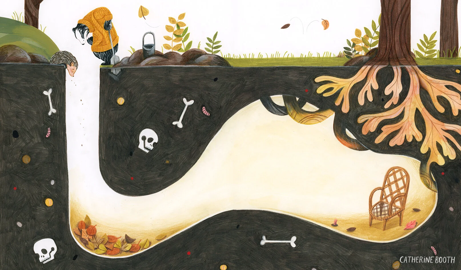
Prickles the Curious Hedgehog: Scene Process
To begin, I must point out that the process I follow for most book projects is far from coherent. It’s essentially a long stream of problem solving in which I have to, at some point, decide on my characters, colour scheme, narrative flow, setting, the message I’m trying to convey, the number of pages, the size of the book … Right?! So many options. So. Little. Time.
Happy happy New Year!
I hope this first post of 2021 finds you well, and that January was kind to you. Like most of us I transitioned from Christmas to New Year reluctantly, and have spent the first month of the year still at home, trying to balance staying busy with the constant disbelief at what’s happening in the world. Anyhow, I hope this month’s post provides a little light-hearted relief for you. Enjoy!
Today I thought I’d show you a behind the scenes look at how I created this illustration, which is taken from my children’s story about a curious hedgehog named Prickles.
Begin at the beginning
To begin, I must point out that the process I follow for most book projects is far from coherent. It’s essentially a long stream of problem solving in which I have to, at some point, decide on my characters, colour scheme, narrative flow, setting, the message I’m trying to convey, the number of pages, the size of the book … Right?! So many options. So. Little. Time.
I usually start with the text, as it’s the base of my narrative. I wrote this particular story myself, and it’s about 400 words. Once I was happy with the basic narrative outline I then started with visual research. I used to love visiting museums and galleries to begin a project, finding ways I could inject culture and history into my sketches. I also think external sources can add depth and context to images that may seem one dimensional if they haven’t been developed enough. But of course, with the UK being in lockdown yet again my chance of visiting a gallery was zero. So I began with a pinterest board, collating illustrations, fine art paintings for colour and atmosphere, photographs, and anything else that sparked inspiration.

From there I did a huge brain dump of messy, sometimes questionable sketches, of everything and anything I wanted to include within the book. I had to look at a lot of references for the animals, to get the proportions right. Then, with enough research, I started on my storyboards. These are just thumbnail-sized sketches where I plot out the narrative, and decide on what will happen in each scene. As you can see, for this scene I decided fairly early on that the burrow would be the main feature of the page.

This sketch was just smaller than A5.
Development
Then comes development. Fleshing out the narrative by building up characters, finding the perfect setting, asking whether it is day or night? What kind of flowers grow there? Where do the characters live? How do they travel? etc etc. After playing around with the content, I scanned the thumbnail sketch, and sized it up to A3.

Using my lightbox, I then traced the scene onto plain white paper, and worked on the finer details, making sure I could get it as close to the final image as possible (making most of the decisions at this point makes painting the final illustration a lot easier). Of course there are always slight tweaks to be made, like removing the table, or changing the string of lights to tree roots.
Experiment, experiment and experiment some more
Like I said earlier, my whole picture book process is far from coherent, so although this scene looked pretty straight forward, there were other scenes that required a LOT more work, and I can restart them multiple times.
Luckily though, I was happy with the way this scene looked, and I was ready for experimentation. The way I differentiate development and experimentation is this: While development grows your content, characters, story etc, experimentation grows the medium, style, composition. See the difference?

I have to say, this is my least favourite part of the process. I KNOW, controversial, but always find I have the urge to jump to the final artwork as soon as I have the rough sorted. But I know that experimentation can be the difference between a mediocre spread and a spread that really sings. So I reluctantly kept my nice smooth paper away from my desk for a while longer, and worked on some smaller tests first. I think one of the reasons why I don’t love experimenting, is because it’s is the part where self doubt can kick in. As soon as you think you’ve cracked it, you realise there is a better way of doing it and the process starts all over again. I spent about a week making test after test, some days it felt like I’d made no progress. As you can see, I was mainly working out colour, and how the mediums would work together as a whole.
Diving In
Inevitably there comes a point when you don’t physically have any more tests left in you, and it’s time for the MAIN EVENT. I chose to do the final illustration on bristol paper because I’m used to working on that, and I find the paint/crayon combo works well on the smooth surface. I used mainly Faber Castell Polychromos and Carandache Supracolor crayons, and acrylic gouache.
To get an accurate outline I used the pencil sketch I’d made earlier, traced this with my lightbox using a peach-coloured pencil, and sat down to paint. I’d say the whole piece took about two days to complete. I then scanned the image, cleaned it up on Photoshop, and added the text.

And there you have it, one scene complete! What do you think of the finished illustration?
Of course, this is by no means the exact way to create a spread. I’m sure most picture book illustrators work differently, this was just an insight into the way I work, and how I navigate my way through a project. I hope it was insightful in some way! I’d love to hear your thoughts, or if you have different ways of working through a project. You can see the finished scene here!
Aside from illustration, here are some things I’ve been loving this month…
*I finished reading Ballet Shoes and it was wonderful. I also got this book for Christmas which I’ve been dipping into intermittently. It’s full of stories from neglected women from history, which is fascinating.
*I’m obsessed with this recipe at the moment, I’ve already made it four times since Christmas. It’s the ultimate comfort food and has enough pasta and cheese to keep me satisfied throughout winter!
*I’ve been loving the sketchbook characters by Claire Powell recently and have been inspired myself to start a small sketchbook project. I’ll be drawing from my pinterest board and posting on instagram over the coming months!
*Since I’ve been busy drawing I’ve needed a lot of music to keep me occupied and I’m slowly working my way through seven years of BTS albums which, as you can imagine, is taking a while. Recently this song has been a favourite, It’s an oldie, but it makes me hopeful for Spring.
Okay that’s enough for now, I can feel a headache coming on.
Sending you all much love and optimism for February. Remember, they can’t cancel the Spring.
Catherine